Have you ever looked at your website analytics and thought…why isn’t my website converting? People are visiting my website… so why isn’t anyone contacting me?
It’s one of the most common frustrations I hear from female founders.
You’ve spent hours (or maybe weeks) creating your website. You’ve invested in professional branding, beautiful photos, and carefully written copy. You’ve finally hit publish.
Then…
Silence.
No inquiries.
No discovery calls.
No dream clients landing in your inbox.
So naturally, your mind goes to the same conclusion most business owners make:
“I need more traffic.”
More Instagram followers.
More Pinterest pins.
Better SEO.
More Google rankings.
But after designing websites for businesses across multiple industries, I’ve learned something that surprises almost every client.
Most businesses don’t have a traffic problem.
They have a conversion problem.
In case you’re new here…
I’m Michelle, founder of Elevate Collective, and I help female founders create strategic, designer websites—but not at designer prices.
Whether you’re launching your very first website, refreshing an outdated one, or choosing between a Showit template and a custom design, my goal is always the same:
To create a website that actually helps your business grow.
Because here’s the truth…
Pretty websites don’t grow businesses.
Strategic websites do.
Every website I create starts long before I open Showit.
It starts with understanding your audience, your goals, and exactly what your future clients need to see in order to trust you enough to take the next step.
If you’d like to learn more about how we work together, you can explore my website design services here:
https://www.elevate-collective.co/work-together
What does it mean for a website to “convert”?
Let’s simplify it.
A conversion is simply someone taking the next step.
That could be:
- Booking a discovery call
- Filling out your contact form
- Purchasing a product
- Joining your email list
- Downloading a free resource
- Scheduling an appointment
Your website doesn’t exist just to provide information.
It exists to move people from “I’m interested” to “I’m ready.”
And if that isn’t happening, it’s worth asking why.
You probably don’t need more website visitors
While SEO is incredibly important for helping people find your website, Google also emphasizes creating helpful, people-first content and a positive user experience. Getting visitors to your website is only half the battle—you also need a website that converts them into clients. Learn more from Google Search Central.
This might sound backwards coming from someone who designs websites, but I genuinely believe it.
Business owners spend so much time trying to increase traffic that they forget to look at what happens once people actually arrive.
Imagine owning a retail store.
One hundred people walk through the front door every day.
Ninety-eight of them leave without buying anything.
Would your first thought be:
“I need 500 more people to come through the door.”
Probably not.
You’d start asking questions like:
- Is the store easy to navigate?
- Can customers find what they’re looking for?
- Are products displayed clearly?
- Do they understand what makes us different?
- Is checkout simple?
Your website works exactly the same way.
If people are landing on your site but leaving without taking action, sending more traffic to it won’t magically fix the problem.
Instead, you need to understand where you’re losing people.

The biggest reasons websites don’t convert
After redesigning websites for service providers and small businesses, I’ve noticed the same patterns over and over again.
They’re rarely design problems.
They’re strategy problems.
Your visitors don’t know what you actually do
This is probably the biggest mistake I see.
Someone lands on a homepage…
…and after ten seconds they still can’t answer these questions:
- What does this business do?
- Who do they help?
- Is this for me?
- What’s my next step?
If visitors have to figure those answers out themselves, many won’t bother.
They’ll simply leave.
You have about 10 seconds to capture someone’s attention.
That’s not a lot of time.
Research from Nielsen Norman Group consistently shows that users make very quick judgments about websites and will leave if they can’t quickly understand what they’re looking at or how to navigate it.
Your homepage should immediately communicate:
- What you do
- Who you help
- What problem you solve
- Why someone should trust you
Clear always wins over clever.
Your website is trying to say everything
One of the hardest parts of website copy is knowing what not to include.
Many business owners think more information equals more trust.
In reality…
Too much information creates decision fatigue.
People don’t read websites word for word.
They scan.
They’re looking for answers to specific questions.
That’s why I encourage clients to keep their messaging clear, concise, and focused on what matters most to their audience.
Instead of listing every service, every certification, and every accomplishment on your homepage, focus on helping visitors quickly understand how you can solve their problem.
You can always provide more detail deeper within the website.
How I build websites that actually convert
One of the biggest misconceptions about web design is that the design comes first.
It doesn’t.
Before I even open Showit or start thinking about colours, fonts, or layouts, we start with strategy.
Because a beautiful website without strategy is just that—a beautiful website.
It won’t necessarily bring in inquiries.
It won’t automatically attract better clients.
And it certainly won’t grow your business on its own.
Every website I design starts by answering a few important questions.
Who are we trying to attract?
Not everyone.
Your people.
Who is your ideal client?
What are they struggling with?
What questions are they asking before they hire someone like you?
What objections might they have?
The better we understand your audience, the easier it becomes to write messaging that resonates with them.
Your website shouldn’t feel like it’s talking to everyone.
It should feel like it’s speaking directly to the person you want to work with.
What is the goal of your website?
Believe it or not, many business owners have never actually defined this.
Do you want people to:
- Book a consultation?
- Fill out an inquiry form?
- Purchase a service?
- Join your email list?
- Schedule a discovery call?
Every page should support that goal.
If your website is trying to do ten different things at once, visitors are less likely to do any of them.
Clarity creates action.
Does your messaging solve a problem?
One of the biggest shifts I help clients make is changing the focus from themselves to their audience.
It’s easy to write about your experience, certifications, and process.
Those things matter.
But your visitors are asking themselves one question:
“Can you help me?”
Your website copy should acknowledge their challenges before introducing your solution.
When someone feels understood, they’re much more likely to trust you.
That’s why strategic messaging is so much more powerful than simply describing your services.
Is the experience easy?
User experience isn’t just about making your website look good.
It’s about making it effortless to use.
Can visitors quickly find your services?
Is your navigation simple?
Are your buttons obvious?
Can someone move through your website without getting lost?
Every click should feel intentional.
Every page should answer the next question your visitor is likely to have.
When your website feels easy, people stay longer—and they’re more likely to inquire.
Real examples of small changes that made a big difference
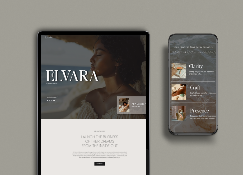
One of my favourite parts of this work is seeing how relatively small strategic changes can completely change the quality of someone’s inquiries.
One client, a therapist, wasn’t getting many inquiries through her website.
The design looked nice, but the messaging wasn’t connecting with the people she wanted to reach.
After clarifying who she helped, simplifying the copy, and making it easier for visitors to take the next step, she started receiving more inquiries from people who were genuinely looking for her services.
Another client was attracting plenty of inquiries—but they weren’t the right fit.
After adding “Starting at” pricing to the website, something interesting happened.
The number of inquiries didn’t necessarily skyrocket.
The quality did.
People contacting her already had a better understanding of her investment, which meant fewer conversations with people who weren’t ready and more conversations with people who valued what she offered.
Those are the kinds of changes I love.
Not because they’re flashy.
Because they’re strategic.
Your website is your hardest-working employee
I say this all the time because it’s true.
Your website works when you don’t.
It’s answering questions while you’re sleeping.
Building trust while you’re spending time with your family.
Explaining your services while you’re meeting with clients.
Generating inquiries while you’re on vacation.
No employee works 24 hours a day.
Your website does.
So ask yourself:
If your website were an employee…
Would you be happy with its performance?
Would you keep someone on your team who confused customers, forgot to ask for the sale, or made it difficult for people to get in touch?
Probably not.
Your website deserves the same attention.
When it’s built strategically, it becomes one of the most valuable assets in your business.
Three things you can improve today
If I landed on your website today, these are the first three things I’d look at.
1. Add more calls-to-action
Don’t assume visitors know what to do next.
Guide them.
Include buttons throughout your pages that encourage people to:
- Book a consultation
- View your services
- Contact you
- Learn more
Think of your website as leading someone through a conversation.
Every page should naturally point them toward the next step.
2. Simplify your navigation
Take a fresh look at your menu.
Could someone who has never visited your website before understand it immediately?
Can they find your services?
Your contact page?
Your pricing?
The easier your website is to navigate, the easier it is for people to become clients.
3. Cut your copy in half
Okay… maybe not exactly in half.
But probably more than you think.
Most websites try to say too much.
Instead of writing longer, write clearer.
Ask yourself:
Does this sentence help someone make a decision?
If not, it probably doesn’t need to be there.
Remember:
People scan before they read.
Clear, concise messaging almost always performs better than long paragraphs.
If you’re using Showit…
I’m often asked why I recommend Showit to so many of my clients.
The answer is simple.
It gives you the flexibility to create a custom-looking website without feeling boxed in by a rigid builder.
Whether you choose one of my boutique Showit templates or invest in a custom website, the goal is the same:
To build a website that’s strategic, easy to manage, and designed to grow alongside your business.
If you’re thinking about using Showit, get one month free of Showit here!
(Insert your affiliate link.)
Final thoughts
If there’s one thing I hope you take away from this article, it’s this:
A beautiful website isn’t enough anymore.
Your website needs to communicate clearly.
Guide visitors confidently.
Build trust quickly.
And make taking the next step feel effortless.
Because at the end of the day, your website isn’t there to impress people.
It’s there to help them make a decision.
So before you spend more money on ads, try to grow your Instagram following, or worry about getting more website traffic, ask yourself one simple question:
If more people landed on my website tomorrow, would they actually convert?
If the answer is “I’m not sure,” then that’s where I’d start.
A few strategic changes can completely change how your website performs—and ultimately, how your business grows.

Frequently asked questions
Why is my website getting visitors but no inquiries?
If people are visiting your website but not reaching out, it’s often because your messaging isn’t clear, your calls-to-action are too limited, or visitors aren’t sure what to do next. A strategic website guides people through their decision-making process instead of expecting them to figure it out on their own.
How do I make my website convert better?
Start by understanding your audience. Then simplify your messaging, improve your navigation, add clear calls-to-action throughout your website, and make sure visitors immediately understand what you do and who you help.
What makes a website high-converting?
A high-converting website speaks directly to its ideal audience, solves a clear problem, builds trust, removes friction, and makes it easy for visitors to take the next step.
Should I redesign my website if it isn’t getting leads?
Not always. Sometimes your existing website simply needs stronger messaging, better calls-to-action, improved navigation, or updated imagery. A strategic audit can help identify what’s working before investing in a complete redesign.
How often should I update my website?
Your website should evolve as your business grows. Review it at least once a year to ensure your messaging, services, imagery, and calls-to-action still reflect your business and support your goals.
Your website should work as hard as you do
Your business has grown.
Your expertise has grown.
Your website should grow with it.
Whether you’re looking for a professionally customized Showit template or a completely custom strategic website, I’d love to help you create a website that reflects the quality of your work and turns more visitors into aligned clients.
👉 Book your free consultation here: https://www.elevate-collective.co/work-together